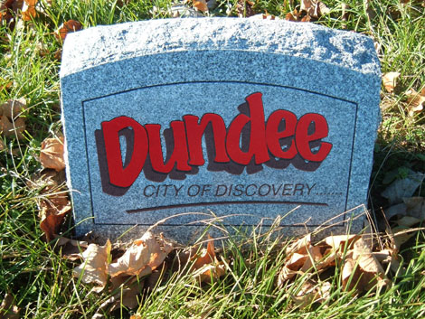
If ever there was cause for a celebration then it is surely the news that Dundee is finally going to ditch the ugliest excuse for a logo that ever wasted printers ink. The old Comic Sans-esque monster has “become out dated” according to the City Council. Phew, glad they spotted that before it became embarrassing!
It reminds me of a meeting I had with a council member who’s name I have long since forgotten. We were sat in the DCA having a coffee and he was asking me some questions for a Dundee related magazine. At the end of the interview he asked what I thought of the ‘City of Discovery’ logo? My response was the verbal equivalent of being caught short with a really bad stomach bug.
He looked really upset and told me that the council had conducted a survey and found that the identity was “very recognisable” I reminded him that the same could be said for other identities like, well lets say… London 2012 (it wasn’t though it was more likely an equilateral cross with arms bent at right angles) but that does not mean people like them.
So, a large hole is being dug big enough to fit all those signs that greet the visitors to our city and a new identity is currently developing in a designers brain. Which leaves us to ponder… what will they do?
Well, some info is available. The identity is being developed by The Leith Agency for a paltry £73,087p, it is based on the slogan “Dundee ignites a spark in everyone, encouraging them to embrace all life has to offer”… so it’s going to be a spark then! We will have to wait a little longer to find out, it is likely to be unveiled, around July time.
I am quietly excited to see what has been produced, if slightly disappointed that an Edinburgh based agency was needed to brand Dundee. Let’s hope it’s a DoJ graduate thats working there!
If anyone fancies having a stab at what they think the Dundee logo will or should look like and emailing them to news@creativedundee.com I might start a little gallery going… maybe I will find a prize for the one that is closest to the final result!