21.08.19
Ryan McLeod, Designer and Director at Agency of None, and Connor Finlayson pitched for last year’s Community Ideas Fund with the idea of a Typography Treasure Hunt and were selected by the Amps community. In this blog Ryan describes the process of developing the project!
We are surrounded by typography. It’s everywhere. Our lives are saturated by it. So many different things constantly vying for our attention, trying to shout their message the loudest in a landscape of visual noise. It’s no wonder we try and filter it out as we rush around in our daily lives. But in amongst it all there are some truly beautiful examples of typography. Some old, some new, some forgotten, some hidden in plain sight and some that are just under appreciated.
Back in August 2018, designer Connor Finlayson set up an Instagram account called typedundee to capture serendipitous typography from the nooks & crannies of the city. At a Creative Dundee Amps event I got chatting to Connor about the photos they’d taken and the potential to develop the concept further.
Fast forward a month or so and we were pitching the idea of a Typography Treasure Hunt event to the Amps Community Ideas Fund. A one-off event to get people excited about typography and out exploring the city in a new way. We won the pitch and the funding to bring our idea to life.
After a few months stewing on our initial thoughts it became clear that just creating a physical treasure map was not really going to be enough. We wanted to integrate an educational element. Not in a lecture theatre theorising the fundamental failings of Comic Sans kind of way. More in a peppering of fun sized tidbits of knowledge, kind of way.
It was also important that this event reached beyond the creative community audience. I am a firm believer that design should be accessible to all and as a UNESCO City of Design we have a responsibility to break down the barriers to entry that exist. You don’t need to have fancy software, access to educational institutions or be a practicing designer to play, explore and enjoy design. Across Dundee there needs to be more opportunities for everyone to get hands on with design. By creating these opportunities we can start to help people understand what design really is, the power that it can have and how they can start using it themselves.
The Typography Treasure Hunt was designed so that anyone at any level of knowledge could get involved, have fun and take something from it. It was also part of the 2019 Summer Streets Festival programme which captures a broad Dundee demographic at a time when there’s a real buzz around the city centre.
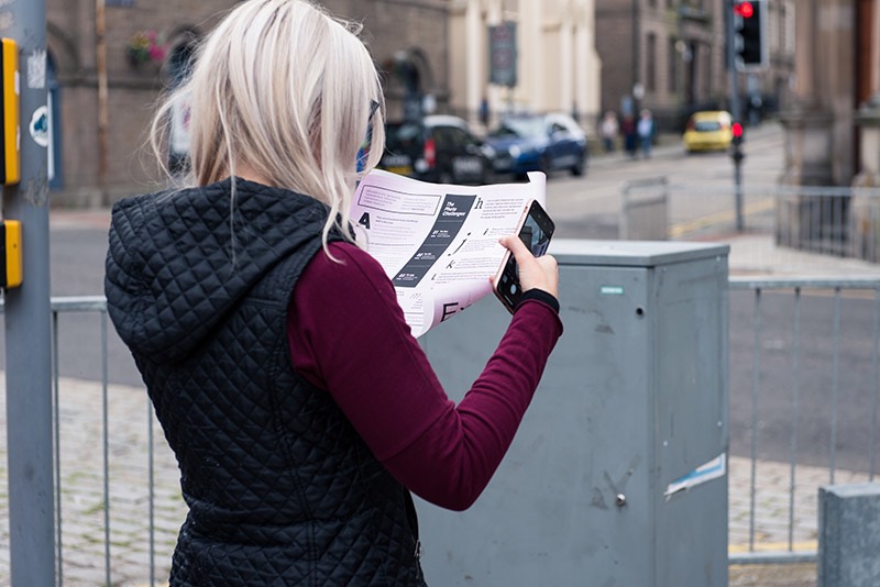
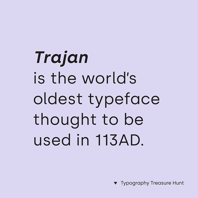
So how did we make it fun? We started with the printed treasure map, basing it around interesting insights into typographical history, local history and by giving context to elements on the streets that are often overlooked. As well as a treasure map, each participant was given a free ’pangram print’ to take home.
A pangram is a sentence that uses every letter of the alphabet and is often used by typographers to test out typefaces. As part of the event we designed 30 of these posters each using a different typeface and a different pangram, which were all on display at the venue. We also knew there would be a couple of points throughout the event for people to mill around or grab a seat, so we created a slideshow of fun font facts for people to enjoy. These elements helped add to the whole experience ensuring that participants felt surrounded by fun and interesting content throughout the event.
Before we set the teams off into the city to find typography treasure, we showed this brilliant animated history of typography by Ben Barrett-Forrest. It teaches some of the basic typography terminology in an accessible format for all ages. It also allowed us to take some of the terminology explained in the video and to integrate it into the treasure hunt itself.
Each of the teams were given 45 minutes to complete the hunt and the photo challenges. The challenges were simple. Find the an example of new, old and ugly typography. The team with the best photo in each category then received a typography based prize.
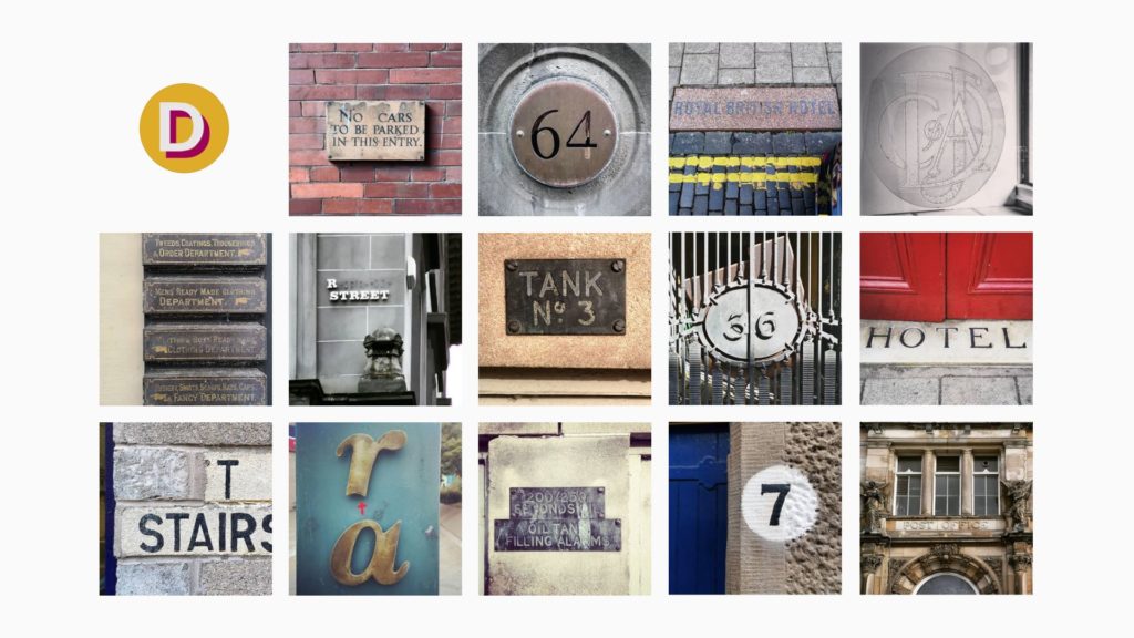
The photographs that came back were wide and varied with some great examples that we had never seen before. Here are just a selection of what was submitted but I’ll let you decide what category they fall into.

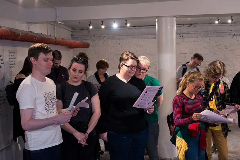
The feedback from the event was overwhelmingly positive. It engaged a really broad audience, from professional designers to those with little prior typography knowledge. It was amazing to see people coming together, meeting for the first time and discussing design and typography. As a city and a creative community we need to try and engage a much wider audience in design and creativity. Events like this are a great way to do it.
Without the Amps Community Ideas Fund this project would not have been possible. It’s a fantastic way to allow creatives to prototype and test out ideas. I’d love to see more people bringing ideas to life, testing them out and seeking feedback and critique. The more we can do this the more we can learn and grow together.
If you would like to support us in creating even better content, please consider joining or supporting our Amps Community.