04.06.21
In this edition, we have illustrator Headless Greg who was commissioned to work on Creative Dundee’s Small Society Lab. He writes about his process approaching this brief and how he approaches his work in general.
We’ll be sharing a blog round up on Small Society Lab 2021 soon and we look forward to using Greg’s identity work in future SSLs.
My name is Headless Greg – or Greg McIndoe, whichever you prefer – and I am an illustrator and design writer based in Glasgow, Scotland. I graduated from Duncan Of Jordanstone College of Art And Design in the Summer of 2020 and have since been chosen as One To Watch by D&AD and won a YCN Award. My design work is all about abstraction and I love nothing more than playing with shapes! Over the past year, I’ve worked with Ancestry, the Make Bank, Tai Ping, and, most recently, Creative Dundee.
I was thrilled when Creative Dundee approached me to design a poster and suite of designs for their Small Society Lab project. To be completely honest, I didn’t really know what “suite” meant in the context at first but once I had a fuller brief, I knew it was something I was keen to design. Having previously studied it at college, I enjoy dabbling in graphic design alongside illustration and this brief called for both. Designing templates for social media posts and slideshow presentations required typographic and layout skills while there was room for more personality-led, illustrated fun with elements like the poster. There was a lot to design with plenty of themes to explore and not a ton of time to do it in. After a few days of letting all my initial ideas bounce around at the back of my head, I got to work.
As much as I’d like to be for the Instagram content, I am not the type of illustrator who does neat little drawings in a fancy sketchbook. I prefer big ugly scribbles on a cheap bit of paper as a way of working out the basics before swiftly moving onto working things up digitally. I can be quite guilty of jumping straight to digital work but something a bit more analogue is the best way to brainstorm. For Small Society Lab, this scribbly stage was about getting the different themes of the project down on paper while thinking about how to tie them all together visually.
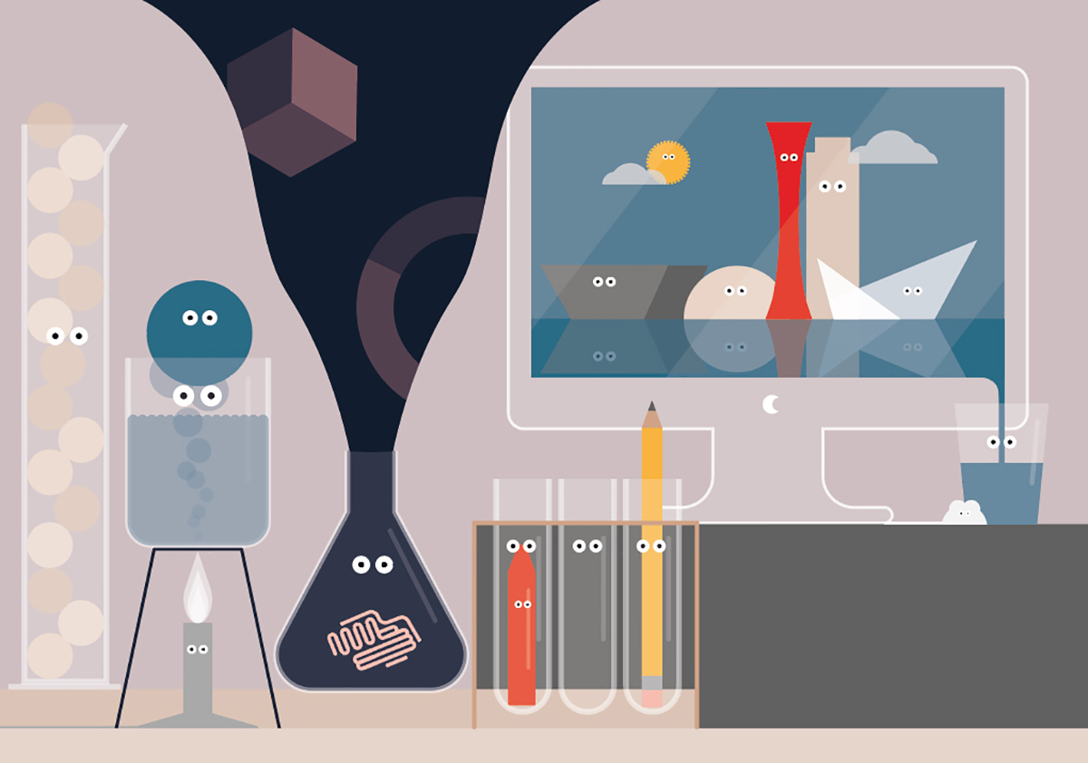
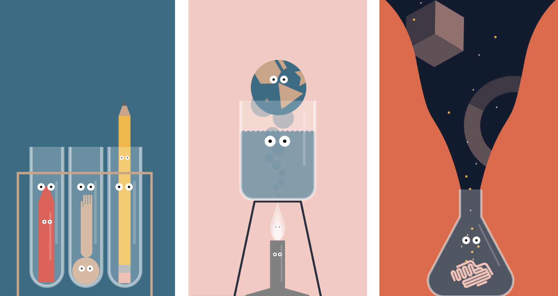
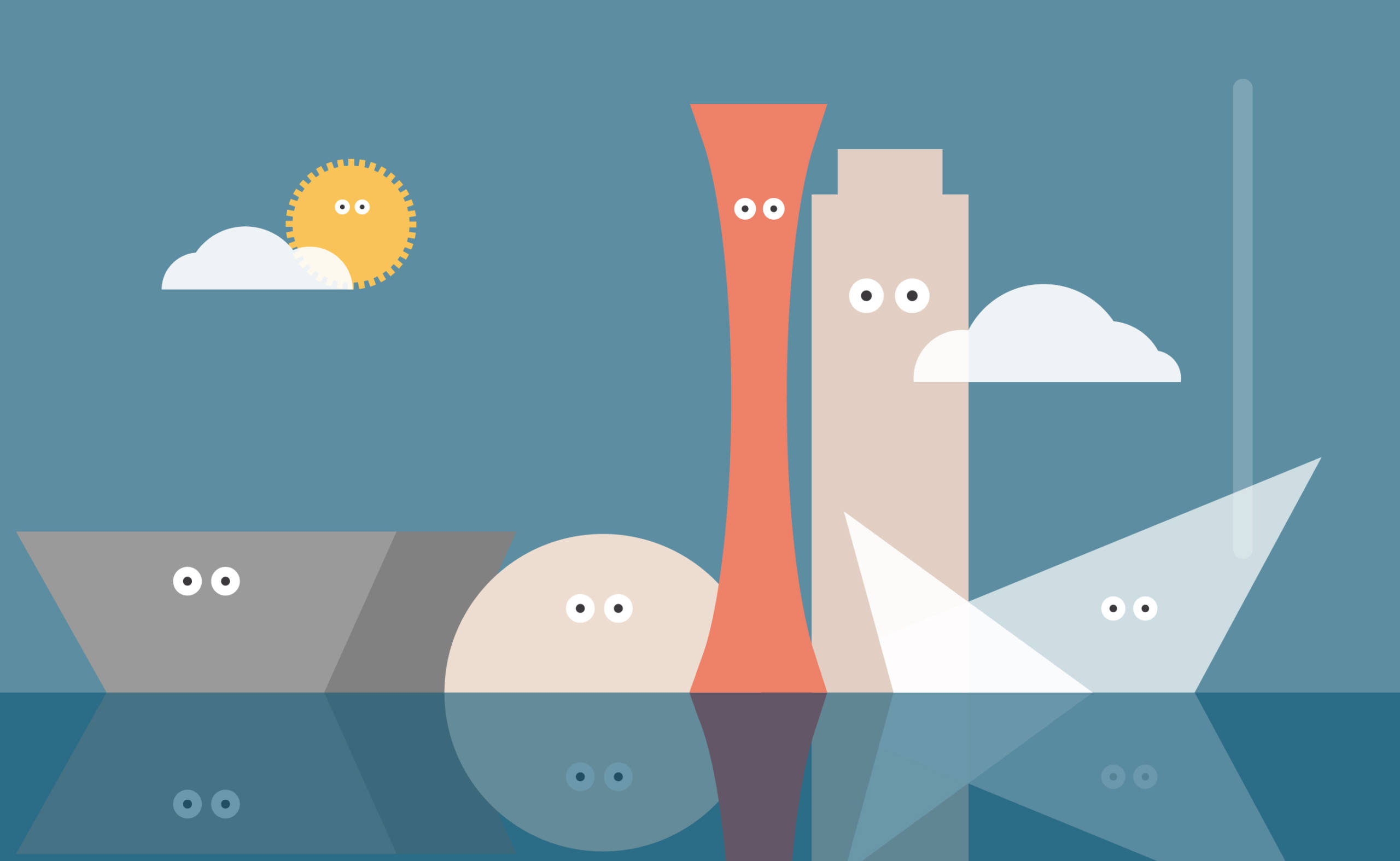
The most obvious starting point for me was the biggest task – the poster. It would hold all the assets in one place which could then be split up for all the different elements of the “suite” (a word I now understand and enjoy using). I decided to lean into the idea of a lab and use it as a way of visualising all of the different themes in a slightly abstract and playful way. The lab concept gave plenty of room to play with scale, with tubes full of heads and hands being not too different in size from an entire planet simmering in a beaker. The poster shows lots of different elements hinting at different themes including the environment, diversity, education and creativity. There is even a blended skyline features buildings from both Dundee and Kobe.
Colour is something which always plays a major role in my creative work. For this project, I started with a basic duo of red and blue – inspired by the flags of Scotland and Japan – and built from there. This was one area where working with Janine Matheson producing SSL for Creative Dundee was particularly useful. Originally, I had a much more muted colour scheme in mind but I was encouraged to go in a much brighter direction and I am very glad I did. Cheerful yellow helped add the hopeful and excited tone of the project while a touch soft pink and contrasting navy provided a bit of balance.
This collaborative attitude was present throughout the entire Small Society Lab project and I am so grateful for it. You can get so tired of looking at your own design work that you lose all concept of whether it is any good. “Are there too many wee eyes on this illustration?” is a question I ask myself a surprising amount and sometimes you just need someone to say “No, that’s the perfect amount”. The whole experience was extremely encouraging and it was uplifting to gain a confidence boost as well as some more professional design experience. As someone just entering the industry, you don’t hear enough stories of when client relationships go really well and so I am happy to report this was a very positive experience from start to finish.
One thing you do hear a lot of after you graduate and start freelancing is “What’s your goal for the future?”. It’s probably the question I find hardest to answer as it feels like it is asking for a specific answer. While working with Creative Dundee, I was also redesigning my website. The edited selection of projects in my shiny new design portfolio – varying from geometric paper packaging to books about mental health – show the direction I’d like my career to grow in. Having said that, I am also open to new and unexpected challenges too. Illustrating test tubes with eyes wasn’t necessarily something I had envisioned in my future but it’s been absolutely lush.
Ultimately, going forward I want to work with nice people to breathe colourful personality into interesting projects just as I have with Small Society Lab. If that sounds like something you’d like to do too then please do come and say hello!